We published a logistic regression model for fishing localization a while a go as a python library built on top of scikit-learn. In this blog-post I’ll give you a quick introduction to how it can be used.
The data we’re going to use is an AIS track exported from Google’s BigQuery, containing the columns timestamp (seconds since epoch), course (degrees) and speed (knots). In addition, we’re passing through the columns lat and lon, but they’re not used by the models.
First we need to load the library and some helper libraries, as well as the pylab environment for visualization so that we can plot the results. We also need to load the model parameters. Model parameters are stored as json files in the models subdirectory of the library. The library comes with both a generic model trained on all types of fishing vessels, as well as more specialized models trained on individual gear types.
%pylab inline

import vessel_scoring.models
import json
import datetime

models = vessel_scoring.models.load_models()
Populating the interactive namespace from numpy and matplotlib
To load the data exported from BigQuery we need to parse the JSON and convert the data types. Alternatively, if your data is in properly formatted GPSD format, you can use the gpsdio library to load it as the columns used by the vessel scoring library matches the ones used by gpsd.
def messages_from_bq_dump(path):
    with open(path) as f:
        for row in f:
            row = json.loads(row)
            row = {key: float(value) for (key, value) in row.iteritems()
                if key in ('timestamp', 'course', 'speed', 'lat', 'lon')
                  and value is not None}
            row['timestamp'] = datetime.datetime.fromtimestamp(int(row['timestamp']))
            yield row
Load the messages and run the generic model predictor on them:
messages = models['Logistic'].predict_messages(
    messages_from_bq_dump("/home/redhog/Downloads/results-20170601-170811.json"))
That’s all code that’s needed to use the library to predict fishing.messages is an iterator over dictionaries, one for each position. In addition to the input fields these contains the fieldmeasure_new_score with a value between 0 and 1, where 1 means fishing and 0 non-fishing. You can check out these graphs to decide what cutoff you want to use. Depending on the model you chose, there might be plenty of extra fields.
Next, we’re going to load this data into a numpy array so we can plot it using matplotlib:
messages = list(messages)

m = np.zeros(len(messages), dtype=[
        (name, 'float') for name in (
            'lat','lon','measure_new_score','timestamp')])

for idx, msg in enumerate(messages):
    for key in m.dtype.names:
        if key not in msg: continue
        val = msg[key]
        if key == 'timestamp':
            val = (val - datetime.datetime(1970, 1, 1)).total_seconds()
        m[idx][key] = val
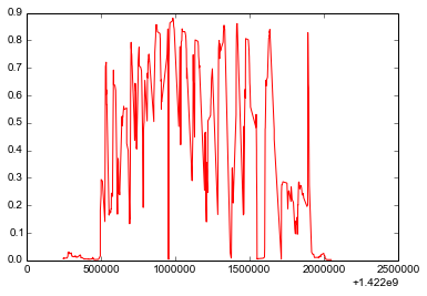
First we’ll plot the score over time:
plt.plot(m['timestamp'], m['measure_new_score'], color='red')
plt.show()
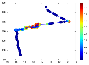
And finally let’s plot the score as colors on the track:
plt.subplots(1, 1)
plt.plot(m['lat'], m['lon'])
plt.scatter(m['lat'], m['lon'],
            c=m['measure_new_score'],
            cmap='jet',
            edgecolors=plt.cm.jet(m['measure_new_score']),
            s=64)

plt.colorbar()
plt.show()
